The model
How the score actually works
Every curve on this page is plotted from the constants the app actually runs on, and every number comes out of the real scoring engine. Nothing here is a simplified version for the website. This is the standard scoring model — the one every install runs today, and the one everything below describes.
The index
Everything you log carries a signed score. Your index is those scores summed for the period and then passed through a bounding curve, so it always lands between −100 and 100.
Bounding does more work than it sounds like. It squashes the extremes: the gap between a decent day and a really good one is easy to see, while the gap between a really good day and a frankly excessive one is barely there. You can't pin the meter by logging fifty things before bed, and you can't bury a rough week under one heroic Saturday.
Decay by repetition — the part that's actually unusual
An entry's value depends on how many times you've logged that same thing lately — specifically, in the previous 14 days. The tenth coffee this fortnight is worth less than the first. The tenth coffee since last spring is just a coffee.
That trailing window is what keeps the decay honest. A habit you drop stops being held against you: leave a label alone for a fortnight and it's back to full value, exactly as if you'd never logged it. Nothing is permanently devalued for having once been a habit — which also means the model is measuring what you're doing now rather than what you used to do.
That one choice is what keeps the score from being farmable. Without it, the winning move would be to find the cheapest positive thing you can log and log it forever — a fun exploit, and a completely useless number at the end of it. With decay, the cheap thing stops paying, and actually varying what you do is what moves the meter.
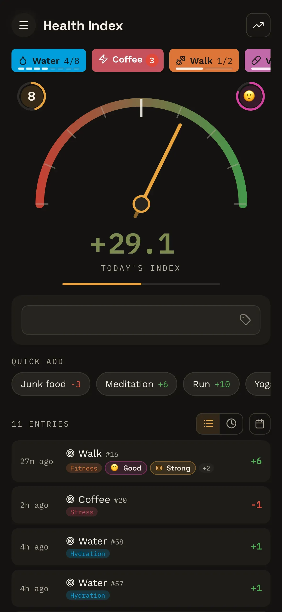
Here it is happening, in the real app against seeded data — the same entry logged six times, with the index climbing by less each time.
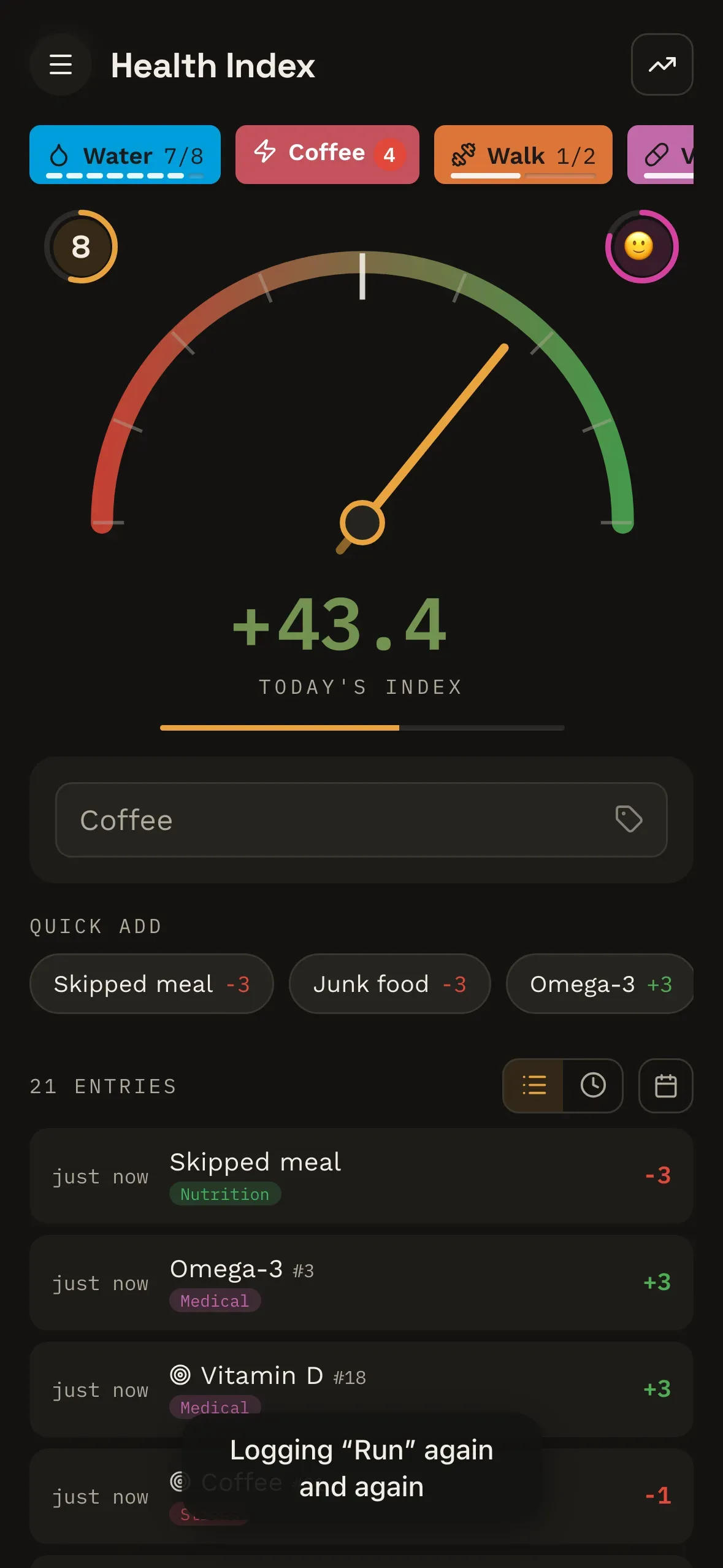
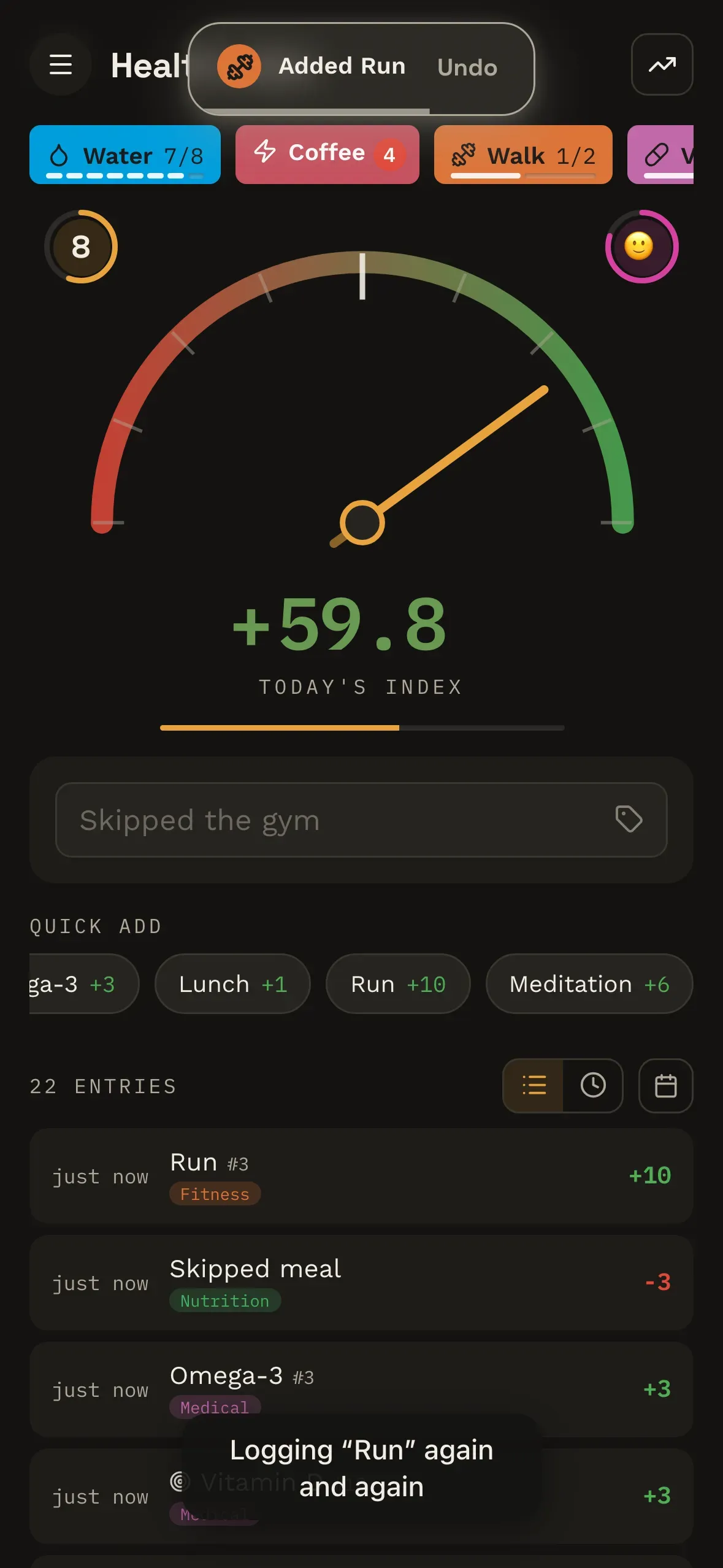
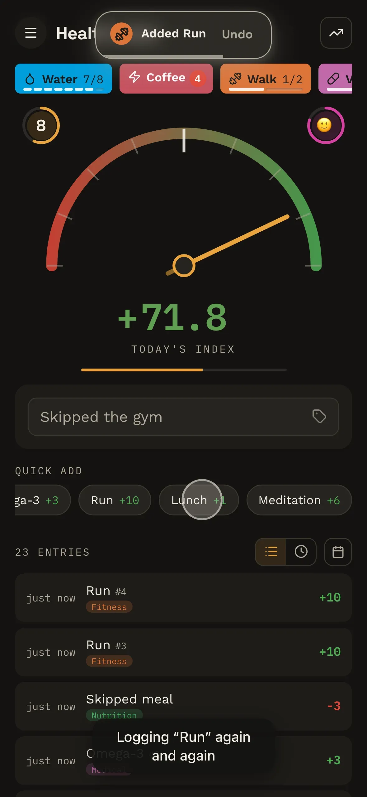
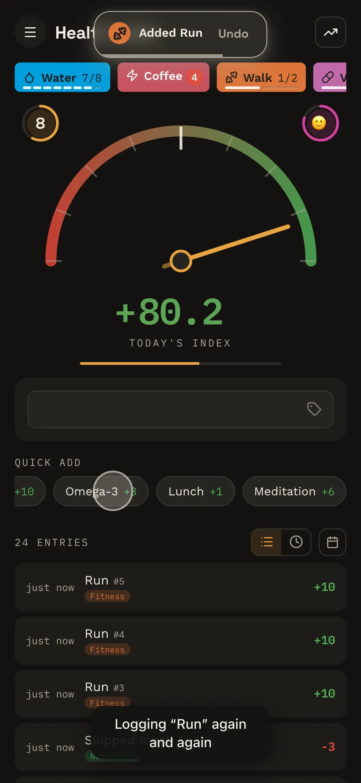
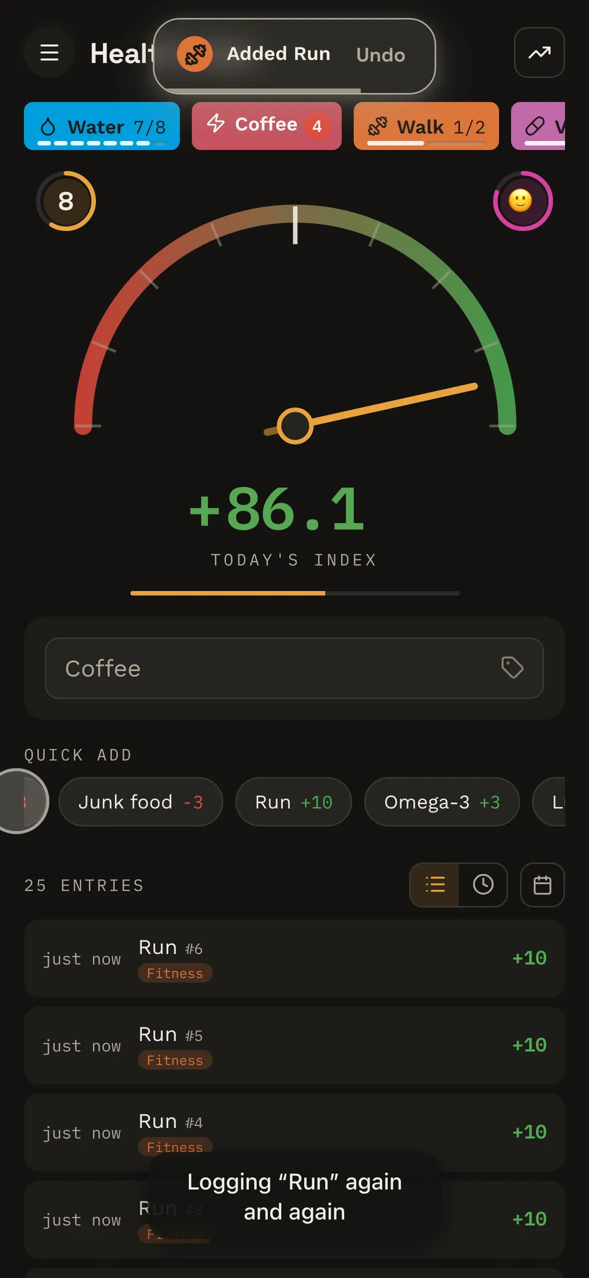
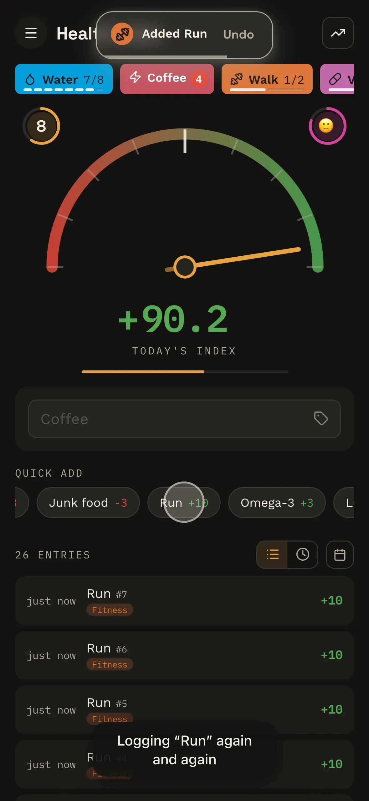
One honest note on what that sequence shows. The shrinking is decay and the bounding curve working together, not decay on its own — as the index climbs, the bounding curve compresses each addition too. The curve below is the decay half in isolation.
Positives and negatives settle differently, on purpose
Those two curves fall at exactly the same rate. What differs is where they stop — and that gap is the whole ethical position of the scoring model in one picture.
A positive you repeat settles at a little under half its first-time value. Doing the same good thing every day still counts for something — it never reaches zero — it just stops being the lever you pull to raise your score.
A negative you repeat settles higher, at around three-fifths. The tenth cigarette is not meaningfully cheaper than the first, and it would be a strange model that said otherwise.
Any other arrangement would be a small lie. If a repeated negative faded as far as a repeated positive, a habit would cost you less the more entrenched it became — which is precisely backwards.
Frecency, and why the order shifts
Quick-add is ordered by recency and frequency together — not alphabetically, and not by a list you have to maintain. What you log often and logged recently sits near the top. What you logged constantly last year and not since drifts down where it belongs.
The order moving under you is the feature, not a bug. It's why logging gets quicker the longer you use it, and why there's no list to sit down and tidy on a Sunday.
Tags, tracked items and targets
Tags are the organising layer — fifteen built in, each with its own colour and icon, plus any you invent. Every entry can carry a few.
A tracked item is something you've promoted to its own chip because you log it constantly. Tapping the chip logs a perfectly normal entry — it's a shortcut into the same flow, not a parallel counter running alongside it, so tracked things move the meter exactly like everything else.
A target is what you're aiming for on a tracked item, and the progress reads on the chip itself. Which means the tray quietly doubles as today's to-do list without ever calling itself one.
Badges and levels
Badges are condition-driven and tiered: each one describes a metric and a ladder of thresholds, and you earn a tier once. Your level comes from XP, which is derived from what you've done rather than stored as a running total.
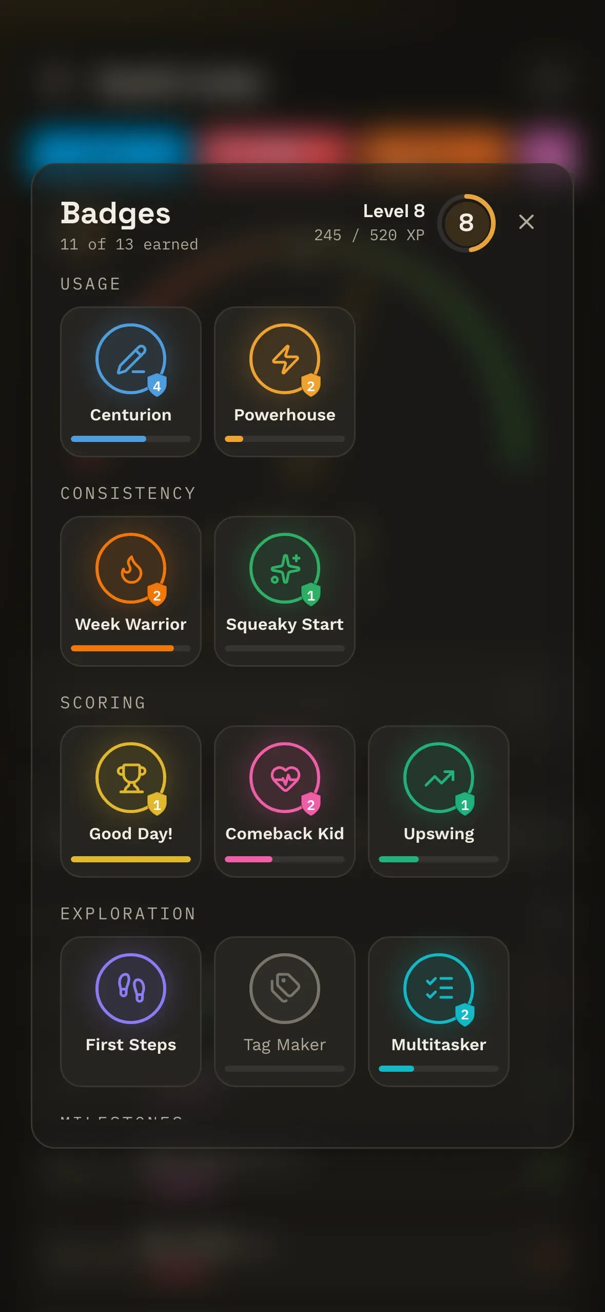
That sounds like an implementation detail and it isn't. It means thresholds can be retuned once the beta shows what the numbers actually look like in the wild, without invalidating anyone's history, requiring a migration, or quietly taking a badge back off someone who earned it.
What it deliberately doesn't do
- No wearable sync, no device integrations. You log what you did. Nothing gets guessed at from a sensor on your wrist.
- No calorie or nutrition database. It is not going to ask you how many grams of chicken that was.
- No AI. There's no machine-learning model anywhere in here and nothing is generated advice — which also means nothing in it can confidently make something up at you.
- No feed, no leaderboard. Nothing you log is visible to anyone else.
- No streak the index cares about. Decay counts repeats, not days, so a gap in the calendar changes nothing about your score. There are streak badges — they track your best run, so a lapse never takes one away.
- No medical claims. It reflects what you tell it. It does not diagnose, treat, or predict anything.
If that list rules you out, it's meant to. Far better to find out here than three days after an invite lands.
What it does do, once there's a fortnight of entries in it: tell you which days moved your score most, which tags you're genuinely active in, and — on anything you track — the weekday and the hour it really happens rather than the ones you'd have guessed. The model is half the point. The other half is what it lets the app tell you.